Best MacBook Color Settings for Everyday Use: Complete Guide

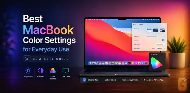

The optimal display setup for everyday MacBook usage is the factory-default Color LCD profile with True Tone enabled and brightness set to automatic. macOS uses system-level color management to accurately map standard web content and wide-gamut media without requiring manual profile changes. You do not need to lock your screen into sRGB for routine daily tasks.
Setting up a new MacBook Air should feel effortless, yet display preferences regularly confuse new and experienced users alike. Between P3 wide color gamuts, sRGB profiles, True Tone ambient sensors, and Night Shift schedules, choosing the best macbook color settings for everyday use often seems more complicated than it actually is.
Most people want clean text for reading, accurate skin tones in video, natural map colors, and comfortable web browsing without eye fatigue.
The good news is that Apple’s modern display architecture handles nearly all the heavy lifting automatically. Below is a technical breakdown of how macOS manages color, why factory defaults work best, and the few specific settings worth adjusting for daily comfort.
The Short Answer: What to Use for Everyday Use
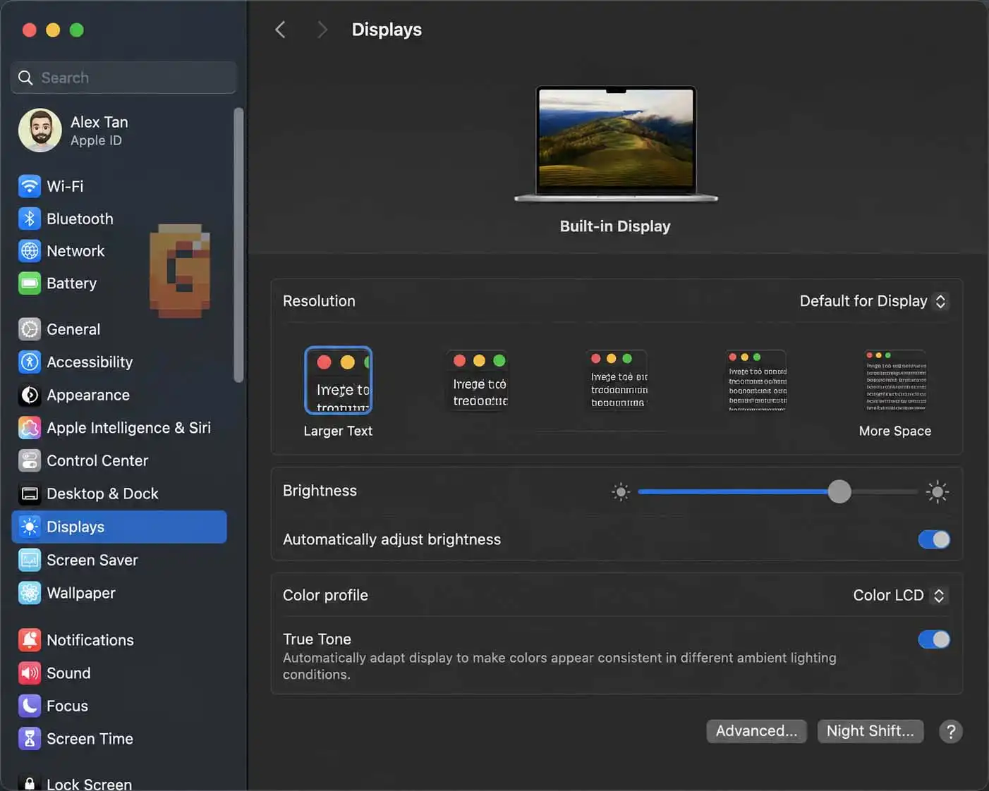
The most balanced display configuration for everyday tasks on a MacBook is the factory-calibrated Color LCD profile paired with True Tone turned on. This combination delivers sharp text, accurate rendering across web browsers, and automatic white-point adjustments that reduce eye strain in changing room lighting.
| Setting | Recommended Value | Primary Benefit |
|---|---|---|
| Color Profile | Color LCD (Default) | Panel-tuned P3 gamut with automatic macOS color mapping |
| True Tone | ON | Adapts white balance to room light for paper-like reading |
| Night Shift | Custom Schedule or Sunset/Sunrise | Reduces blue light exposure during long reading sessions |
| Auto-Brightness | ON | Matches ambient room illumination automatically |
For general activities like browsing in Safari, reading documents, navigating maps, and streaming video, manual color recalibration is unnecessary. Apple calibrates MacBook Air displays at the factory to target the standard D65 white point using an sRGB-compatible transfer curve.
Keeping your Mac on these default settings ensures that both standard web graphics and modern wide-gamut media appear balanced and natural.
Color Profile: Should I Change My MacBook Color Profile?
No, you should not change your MacBook color profile for everyday computing tasks. The default Color LCD profile allows macOS to manage color spaces dynamically, ensuring standard content looks natural while wide-gamut media retains its full depth.
A common misconception suggests switching the display directly to an sRGB profile because the internet was built around sRGB standards. That advice misunderstands how modern operating systems handle color assets.
macOS relies on an internal color engine known as ColorSync. When your screen remains on its native Color LCD profile, ColorSync identifies the embedded color profile of every image, video, and application interface.
- When viewing standard sRGB content: ColorSync reads the sRGB tag and maps those exact color coordinates into your display’s native space without stretching them. Red buttons stay the correct shade of red, and interface elements do not become oversaturated.
- When viewing wide-gamut P3 media: ColorSync unlocks the broader range of greens and reds available on the panel, rendering richer tones in modern photos and HDR video.
Manually forcing your display into the sRGB IEC61966-2.1 profile restricts the panel hardware at the software level. It prevents your screen from rendering wide-gamut colors even when viewing media specifically mastered for modern displays. For general daily use, changing your profile creates an artificial limitation without offering any practical visual advantage.
MacBook Air Display P3 vs Default Color Profile
The default “Color LCD” profile on modern MacBook Air models is Apple’s factory-tuned implementation of the Display P3 color space, tailored to the specific characteristics of your laptop’s panel. Selecting generic Display P3 produces an almost identical image, but the default Color LCD profile incorporates panel-specific factory calibration.
| Profile Name | Color Gamut Coverage | Best Use Case |
|---|---|---|
| Color LCD | Wide Gamut (Display P3) | Everyday use, browsing, general media |
| Display P3 | Wide Gamut (DCI-P3 Primaries, D65) | Generic wide-gamut workflows |
| sRGB IEC61966-2.1 | Standard Gamut (~35.9% visible spectrum) | Legacy soft-proofing, web compatibility testing |
| Adobe RGB (1998) | Wide Print Gamut | Commercial print preparation |
Display P3 covers approximately 45.5% of the visible color spectrum, compared to roughly 35.9% covered by standard sRGB. This gives Display P3 an overall color volume roughly 25% larger than sRGB, with the greatest differences visible in saturated greens, cyans, and deep reds.
Because Apple designs its hardware and operating systems in tandem, the Color LCD profile maps the physical capabilities of your Liquid Retina display directly to system software.
Switching to generic Display P3 rarely causes issues, but it bypasses individual factory panel tuning. Leaving your MacBook on Color LCD guarantees you receive the exact tonal response intended for your machine.
Should I Turn on True Tone for Daily Use?
Yes, you should keep True Tone enabled for general daily use, web reading, and office productivity. True Tone uses multichannel ambient light sensors next to the webcam to measure the color temperature of your environment and adjust your screen’s white balance in real time, making digital pages look more like physical paper.
When reading black text on a bright white background under warm incandescent lighting (around 2700K), an unadjusted monitor set to a fixed 6500K standard appears harsh and blue. Over time, that stark color temperature mismatch can contribute to digital eye strain. True Tone warms up the screen white point to match your ambient lamps, creating a softer reading surface.
When you move into natural daylight or a cool-lit office, True Tone automatically shifts the white point cooler to stay aligned with your surroundings.
The primary reason to disable True Tone is for color-critical creative work, such as commercial video grading or photo retouching, where a fixed, unshifting D65 white point is mandatory. For reading articles, drafting documents, managing spreadsheets, and watching movies, True Tone provides a noticeably more comfortable viewing experience.
Why Does My MacBook Screen Look Yellow?
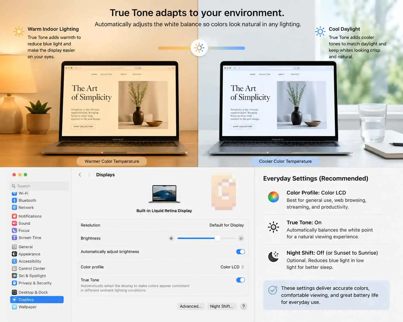
A yellow or overly warm screen tint on a new MacBook is almost always caused by True Tone adapting to warm ambient room lighting or Night Shift remaining active. It is rarely a hardware defect or a corrupted color profile.
Many users upgrade from older laptops with fixed, cool-toned displays, open their new MacBook in a warmly lit room, and immediately assume the display is discolored. Because older screens often defaulted to a harsh blue-white, an accurate, paper-like white point can initially seem warm by comparison.
To determine what is causing the warm tint:
- Test True Tone: Open System Settings > Displays and toggle True Tone off. If the display instantly shifts to a cooler, crisper white, your screen is operating normally—it was simply matching your room’s warm light bulbs.
- Check Night Shift: In the same Displays menu, click the Night Shift button and ensure it is not manually toggled on or active via an unintended daytime schedule.
- Verify Color Profile: Confirm that the Color Profile dropdown is set to Color LCD rather than an altered third-party profile.
Give your eyes a day or two to adjust to True Tone before deciding to disable it permanently. Most users find that once their visual system adapts to ambient-matched whites, turning True Tone off makes the display look uncomfortably harsh and artificial.
Night Shift: Not Just for Bedtime
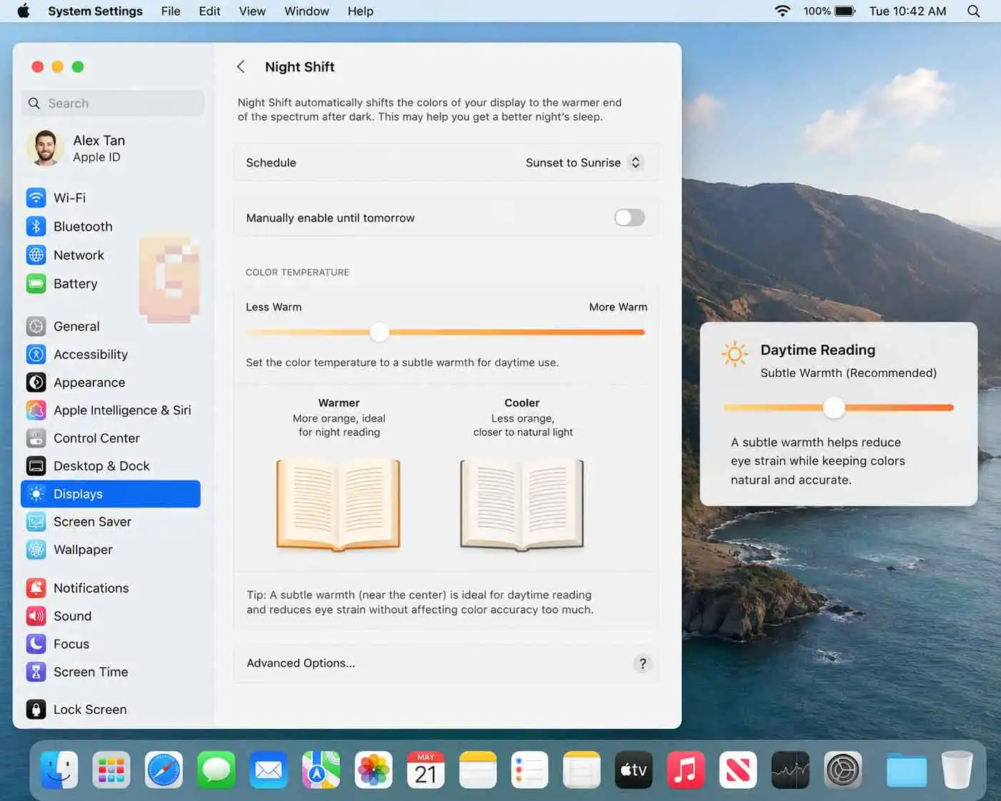
Night Shift shifts the color spectrum of your display toward warmer tones to reduce blue light exposure, and running a subtle amount of Night Shift during daytime work hours can significantly reduce eye strain during text-heavy sessions.
While Apple originally designed Night Shift to assist circadian rhythms before sleep, many users who spend eight to ten hours a day reading documentation, spreadsheets, or dense articles prefer keeping a gentle warm filter active throughout the workday.
Unlike True Tone, which continuously changes based on real-time ambient sensor readings, Night Shift applies a fixed, predictable shift toward warmer color temperatures.
- For long daytime reading sessions: Set a custom schedule (e.g., 9:00 AM to 5:00 PM) and position the color temperature slider roughly 20% to 25% toward “More Warm.” This provides a mild, soothing warmth without distorting user interface elements.
- For evening relaxation: Set the schedule from Sunset to Sunrise and push the slider to roughly 50% to 60% warmth to help ease visual fatigue before bed.
If you regularly experience eye strain despite having True Tone enabled, adding a low-level daytime Night Shift schedule offers an easy, software-based solution.
When to Actually Switch to Display P3 or sRGB
You should only switch away from the default Color LCD profile if you are soft-proofing digital assets for a specific distribution standard or checking how designs render on legacy hardware.
Web developers and user interface designers occasionally need to verify how an image or web asset appears on older monitors that lack wide-gamut support. In those specific testing environments, switching the macOS profile to sRGB IEC61966-2.1 clamps screen output, simulating a standard-gamut monitor.
Commercial print designers preparing assets for CMYK presses sometimes switch temporarily to Adobe RGB (1998) to inspect cyan and green saturation levels that fall outside standard sRGB boundaries.
Outside of professional media production and soft-proofing workflows, changing color profiles manually provides no benefit. For regular web browsing, movie streaming, document editing, and casual gaming, factory defaults deliver the most reliable results.
Frequently Asked Questions About MacBook Color Settings
Does Switching Color Profiles Affect Battery Life?
Switching software color profiles on a MacBook Air does not change battery consumption. Because the MacBook Air uses an LCD panel with a uniform LED backlight, the backlight draws the same power regardless of which color space is selected. Battery drain on LCD hardware is determined by screen brightness levels, not software color profiles.
If you’re looking to protect long-term battery health rather than daily drain, that’s a separate lever entirely — our guide on the best MacBook battery charge limit covers how to cap charging to extend your battery’s lifespan.
Does Turning Off True Tone Make Colors More Accurate?
Turning off True Tone locks your screen to an absolute D65 (6500K) white point. This is essential for color-critical photo editing and video color grading where lighting references must remain static, but for everyday browsing and reading, True Tone offers a more comfortable, eye-friendly experience.
Do Everyday Users Need to Calibrate a MacBook Air With a Colorimeter?
No — everyday users do not need hardware calibration tools. Apple factory-calibrates MacBook panels during production and applies tailored profiles within macOS. Hardware colorimeters are primarily necessary for professional print shops, production colorists, and commercial photo studios.
Why Do iPhone Photos Look Dull When Forcing an sRGB Profile?
iPhone cameras capture photos using the wide Display P3 color space. If you manually lock your MacBook display profile to sRGB, macOS clips those saturated reds and greens to fit the narrower sRGB gamut, making your photos appear flatter and less vibrant than intended.
Conclusion: The Ideal Daily Setup
Configuring the best macbook color settings for everyday use comes down to trusting Apple’s built-in color management rather than fighting it. Modern MacBook Air displays are factory-calibrated to deliver wide color range and accurate rendering right out of the box.
To ensure your display is configured for optimal daily performance, verify these core settings:
- Keep your Color Profile set to factory-default Color LCD.
- Leave True Tone toggled ON for comfortable, ambient-matched reading.
- Keep Automatically adjust brightness enabled to match room illumination.
- Use a subtle Night Shift schedule if you need extra relief during long reading sessions.
With these settings in place, macOS handles standard web graphics, wide-gamut media, and changing room light automatically, giving you a sharp, comfortable viewing experience across all your daily tasks.
Display settings are just one part of getting a MacBook dialed in for daily use — our breakdown of whether you should shut down your MacBook covers another setting most people get wrong.
References & Authoritative Sources
Apple Support: Use True Tone on your Mac — Documentation on ambient light sensors and display white balance adaptation.
Apple Support: Change your Mac display’s color profile — Official guide to system color profiles, factory panel calibration, and ColorSync management.
Apple Developer Documentation: Color Management and ColorSync Overview — Technical architecture explaining dynamic color space translation across macOS applications.